| ▲ | 98.css(jdan.github.io) |
| 418 points by lopespm 8 hours ago | 100 comments |
| |
|
| ▲ | jordanscales 6 hours ago | parent | next [-] |
| Author here! This was my burnout recovery project and holds a place near and dear to my heart. https://notes.jordanscales.com/98-css-reflections |
| |
| ▲ | M95D 6 minutes ago | parent | next [-] | | > I no longer work on 98.css and I haven’t in a really long time. My only contribution to the project is monitoring the repo for high-quality pull requests. If I get one, I briefly scan through the author’s profile to make sure they’re not going to mine cryptocurrency on my user’s machines, and then I give them full commit access. “Looks good, go ahead and merge this yourself.” Very nice! | |
| ▲ | sphars 5 hours ago | parent | prev | next [-] | | Thanks for creating this, it fit perfect for a tiny web site I made[0]. Hits just the right mix of usability and nostalgia and makes me want to use it for more projects. [0]: https://www.mathsheets.net/ | | |
| ▲ | woqe 5 hours ago | parent [-] | | Off topic, I love your site - it's a perfect homage to a loving family tradition (even if it was only for a couple of vacations). This site is, I think, an example of what a beautiful internet could be (and maybe is, if anyone knows got to find more sites like this-really authentic stories). Now, I hope I'm not being fooled by an AI generated story, but even if I am, I am happy to believe in that illusion. Edit: After reflecting on this situation, your creation, your art: the css library paired with your story gave me a modern day Norman Rockwell dopamine hit. This has been an absolute experience, bravo to the collaboration! | | |
| ▲ | sphars 3 hours ago | parent [-] | | I don't have any way to prove it but this was no AI hallucination, a completely true story and human generated site (there is a link to the GitHub on there). I do appreciate your thoughts and I too hope I'm not being fooled by an AI :) |
|
| |
| ▲ | montag 5 hours ago | parent | prev | next [-] | | I used 98.css as starting point for the Winamp theme in https://chiptune.app. It was very easy to modify and extend, thanks! | | | |
| ▲ | Gabrys1 an hour ago | parent | prev | next [-] | | Firefox (Nightly) on Android: tabs don't work: when clicking on a tab, the URL changes, there's a slight jump in content, but the new tab is not selected. Hope this helps | |
| ▲ | dataAI 25 minutes ago | parent | prev | next [-] | | I've also once experienced burnout, a book called Pedram Shojai: The Urban Monk has kept it away since. It's practical, not religious. Highly recommend it! | |
| ▲ | vibbix 5 hours ago | parent | prev | next [-] | | Thank you so much for your project! I have spent the last few months working on my own retro computing CSS library, but instead inspired by BeOS https://beta.mtechnic.me PS: while doing research on my project, I found your portfolio site as well. Was shocked to see we had the exact same taste in music, and genuinely made me curious if everyone whose doing retro throwbacks libraries did as well. | |
| ▲ | redbridgerock an hour ago | parent | prev | next [-] | | You have brought back so many memories of mine through this one website. Thank you | |
| ▲ | timnetworks 5 hours ago | parent | prev | next [-] | | I wrapped many projects in 98.css. And some in Aero and even XP. Thank you! | | | |
| ▲ | bdickason 6 hours ago | parent | prev | next [-] | | Great project. Thanks for making it! Brings back memories | |
| ▲ | mattgerstman 5 hours ago | parent | prev | next [-] | | This is even more impressive knowing that its artisanal code, or as we called it back then, code. | |
| ▲ | titzer 5 hours ago | parent | prev | next [-] | | This is awesome. IMHO things like this were the whole point of CSS. Nice job! | |
| ▲ | dsp2 5 hours ago | parent | prev | next [-] | | I absolutely love this. Thank you for making it and sharing it! | |
| ▲ | uproarchat 5 hours ago | parent | prev [-] | | You nailed it, I'm glad you had a good outlet for it. |
|
|
| ▲ | sodapopcan 5 hours ago | parent | prev | next [-] |
| Flat design is so ridiculous. Made someone a bunch of money. Now everyone follows like sheep. Sorry for the doomer comment but, like, really. I'd love to say that I'm surprised that we haven't gotten over this, but given it's been... 20 years (?)... I'm not surprised. Also, the way multi-row tabs Just Work in the UIs of yesteryear *chef's kiss* |
| |
| ▲ | acchow 5 hours ago | parent | next [-] | | If it takes longer to find stuff on a page, one of the most prized metrics goes up: time on page. And here we are. | | |
| ▲ | cube00 3 hours ago | parent [-] | | > one of the most prized metrics goes up: time on page It took me way too long to realise those widgets that show stats quickly counting up are only there hoping you'll wait until they finish counting to see the total number. All to increase your time on the page and make the metrics look good for the designer. |
| |
| ▲ | spankibalt 3 hours ago | parent | prev | next [-] | | > Flat design is so ridiculous. Flat, or quasi-flat (minimalistic/brutalist), design is fantastic if one makes use of appropriate visual discriminators, e. g. shadows, outlines, contrasts etc. Less is more here. Which makes this design philosophy clash with Apple's, Google's, or their imitators, oversaturated Fisher-Price playdough-UIs. | |
| ▲ | theandrewbailey 5 hours ago | parent | prev | next [-] | | We've been getting flatter over time. Win9x (and even 3.x) styles have subtle 3D cues, like the edges of buttons, window borders, tabs, and text boxes. There were gradients. Apparently, these are technologies that we've lost. | | |
| ▲ | inigyou 4 hours ago | parent [-] | | Win3.1 style was completely flat and ugly though. | | |
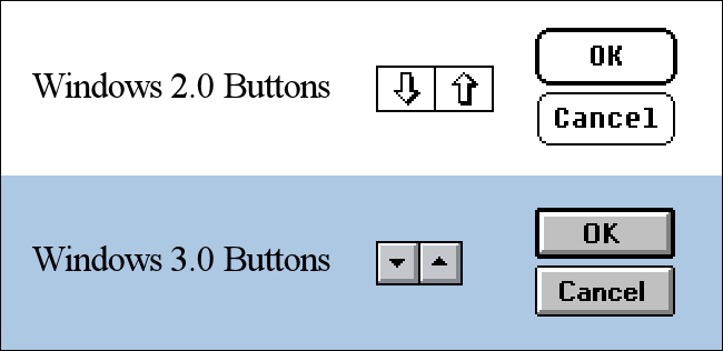
| ▲ | ObscureScience 4 hours ago | parent [-] | | Are you thinking of Win 2.0?
https://static0.howtogeekimages.com/wordpress/wp-content/upl... | | |
| ▲ | sodapopcan 3 hours ago | parent [-] | | I think they must be? Windows 3.1 had depth. Win95 rammped it up in, what we all thought at the time, was a good way. I have this really fond memory of showing my friend (who is still one of my good friends in adulthood) who had installed XP that he could change the theme "back" to look exactly 95/98/2000. His reaction was this very earnest "I love this..." as he clicked around like he was experiencing again for the first time. Anyway, ya, getting a bit off topic into memory lane, but we just had cool UIs back then. |
|
|
| |
| ▲ | spaghettifythis 4 hours ago | parent | prev | next [-] | | Multi-row tabs are the primary thing I dislike about old UIs. You never seem to see them anymore, for which I am immensely grateful. Not only do they take up valuable vertical space, but they way the rows jump around always confused more than it really should have - a button shouldn't move after I click it, especially if it is representing state. | | |
| ▲ | sodapopcan 3 hours ago | parent | next [-] | | My (admittedly spontaneous) thought was that we don't see them anymore because flat design make them almost impossible. Even with dividers, it would just look like a grid. I don't think that more-tabs-that-can-fit-on-one-"line" is ideal, but I think the modern equivalent - horizontal scolling tabs - is waaay friggin' worse. I've been confused by those before whereas the first time I encountered multi-row tabs in the "depth style," I had zero confusion about what I was looking at. | |
| ▲ | hdjrudni 3 hours ago | parent | prev [-] | | As opposed to tabs that either (a) get so small they're illegible, or (b) scroll off the screen so they're no longer accessible? The moving tabs issue we can fix but just not moving them. And the vertical space issue is much less of an issue now than it was then because we have higher resolutions but the answer to that is to start closing tabs when you can no longer see your content. It's like a quiet little nag that says you have too much stuff open. | | |
| ▲ | inigyou 32 minutes ago | parent [-] | | The selected tab has to be on the bottom row for the visual metaphor to work, that's why they move. |
|
| |
| ▲ | RedShift1 2 hours ago | parent | prev [-] | | Not only flat design but also using less color. We have monitors and graphics cards that can display millions of colors now and we refuse to use it... Not that it has to look like a coloring book but sheez Windows 10 and 11 make me feel depressed. |
|
|
| ▲ | gnabgib 8 hours ago | parent | prev | next [-] |
| Popular in 2024 (471 points, 93 comments) https://news.ycombinator.com/item?id=42056918 2022 (606 points, 182 comments) https://news.ycombinator.com/item?id=33310554 2020 (838 points, 211 comments) https://news.ycombinator.com/item?id=22940564 |
| |
|
| ▲ | OsrsNeedsf2P 7 hours ago | parent | prev | next [-] |
| I really want to make one of my websites use this.. I just can't think of one that would fit. Also shout out XFCE-winxp-tc, which makes your Linux look like Windows XP. Lots of people know about Chicago95, but this project is excellent for that 2004 vibe [0] https://github.com/rozniak/xfce-winxp-tc |
| |
| ▲ | dylan604 6 hours ago | parent | next [-] | | man, it's the internet. you don't need a fit. you just need to want to. | |
| ▲ | ranger_danger 7 hours ago | parent | prev [-] | | My gripe has always been that none of these xfce/gtk/etc. themes are ever actually pixel-perfect, even when they claim to be. Not sure if there is a legal concern there or not. | | |
| ▲ | Gualdrapo 7 hours ago | parent [-] | | More than legal concerns is that theming engines on each DE can be a bit limiting trying to do such things. i.e. for KDE Plasma you'd need to do a fair amount of SVG trickery to reach 100% accuracy respect of the originals. Plus the icons thing - they're not as easy as people might think. But this xfce-winxp-tc seems to be really, really close to the original. In those first two screenshots I thought it was just screenshots of the original WinXP. Also the CSS framework subject of this thread looks really identical to the widgets and stuff of Win98. But if you want true 100% pixel-perfect windows 98/xp/whatever... Just use them. |
|
|
|
| ▲ | zemo 6 hours ago | parent | prev | next [-] |
| unjokingly I think the fact that we removed grayed out buttons for "the button just doesn't appear" is one of the more confusing UI trends of our day and the sight of a grayed out button warms my heart |
| |
| ▲ | cube00 6 hours ago | parent | next [-] | | Microsoft had some excellent guidance[1] on this: > Reconsider disabled controls. Disabled controls can be hard to use because users literally have to deduce why they are disabled. Disable a control when users expect it to apply and they can easily deduce why the control is disabled. Remove the control when there is no way for users to enable it or they don't expect it to apply, or leave it enabled, but provide an error message when it is used incorrectly. > Tip: If you aren't sure whether you should disable a control or provide an error message, start by composing the error message that you might provide. If the error message contains helpful information that target users aren't likely to quickly deduce, leave the control enabled and provide the error. Otherwise, disable the control. Unfortunately, that nuance has been lost in the modern version of the guidelines with no mention of disabled buttons at all [2] [1]: https://learn.microsoft.com/en-us/windows/win32/uxguide/top-... [2]: https://learn.microsoft.com/en-us/windows/apps/develop/ui/co... | | |
| ▲ | inigyou 29 minutes ago | parent | next [-] | | Not just this one. It seems like all usability guidelines have been forgotten. The guidelines that remain are not for usability. | |
| ▲ | deathanatos 3 hours ago | parent | prev [-] | | Excellent? No, > Remove the control when there is no way for users to enable it That guidance is unhinged, and is exactly the anti-pattern that upthread points to that needs to die. Removing the control is like gaslighting the user: they're looking for "how to do X?" and documentation, Internet searchable screenshots, and, god help us, now AI, are pointing them at a button that does not exist. I cannot tell you how many times I've frustratingly circled that mulberry bush as a user, for a wide range of products. No, the button (and all other UI elements) should always present/be visible, and if there is a disabled control, there should be a HIG-standardized way to determine why it is disabled. (I.e., a mandatory tool-tip that states what actions would cause the control to enable, though I'd accept that tool-tips themselves are not always discoverable. You could have a small, standardized icon on the disabled control, like an :information-symbol-emoji: that might hit towards the tool-tip, or just put in underneath.) | | |
| ▲ | preg_match 2 hours ago | parent [-] | | I agree, just gray it out and have a little question mark button next to it. Also, way more question mark buttons. I don’t care how well named people think things are. They’re not, and there’s always some hidden behavior you just have to know behind every setting. Include the question mark. | | |
|
| |
| ▲ | nitin7 2 hours ago | parent | prev [-] | | I think the button shouldn't appear if the user doesn't have the access to do it (eg. not an admin, has view rights only, etc). However, if the user can and they expect to do it, but is in a mode/state which doesn't allow them to do it, greyed out buttons absolutely. In some cases, greyed out buttons should be clickable (eg. forms) and that should tell the user what is wrong. Looking at you, billion dollar airline, where I couldn't complete my checkin due to this annoyance. Also, what happened to hover messages and little (?) marks? Every software behaves like it expects me to know what to do from Day 1. | | |
| ▲ | xboxnolifes 31 minutes ago | parent | next [-] | | I agree for admin stuff, but certain lack of permissions hiding stuff is annoying. It's nice for things to be disabled and have a hover text explaining why it's disabled. Also, yes, (?) and hover text in general is severely underused in popular software. I wish every button or menu option that has a shortcut would show me its shortcut on hover or in-place so I didn't have to find it in the manual or buried in the settings menu. | |
| ▲ | inigyou 29 minutes ago | parent | prev | next [-] | | What if the user is an admin but isn't logged in as one, and that's why he can't press the button? | |
| ▲ | fodkodrasz 31 minutes ago | parent | prev [-] | | > Also, what happened to hover messages and little (?) marks? Every software behaves like it expects me to know what to do from Day 1. I truly hate fast-food kiosks for this reason: most expect me to be familiar with their offerings and the menu system of that kios. I relatively rarely visit such places and I was better off with a human asking me 1-3 short questions and paying. I'm not paid to know this shit, I'm the customer. Guess I'm just too old, younger people love this crap for some reason. |
|
|
|
| ▲ | jhoechtl an hour ago | parent | prev | next [-] |
| I do not understand efforts like these. It's not that 98 Windows UI design has been the paramount of UX. Today's technology bloat and layer upon layer of abastractions caused a total bloat. Understanding what is required to make a good UX site, and idenifying the minimum neccessary technological components is it. |
| |
| ▲ | fodkodrasz 29 minutes ago | parent [-] | | You are right, Windows 2000 was the peak of UI design. Since then everything is getting worse, the rounded corners and floating margins being one example. The MacOS and web-designer influences were detrimental to usability. |
|
|
| ▲ | pxtail 7 hours ago | parent | prev | next [-] |
| Nitpick: tabs in the multirow tabs example do not change position randomly as they should when clicked |
|
| ▲ | zkmon 5 hours ago | parent | prev | next [-] |
| With every new version of the OS, the UI desigenrs were forced to show some change and call it improvement, even though those changes functionally unnecessary, more resource consuming, less faster, and less reliable. |
| |
|
| ▲ | pkage 2 hours ago | parent | prev | next [-] |
| I used this to build my personal site: https://ka.ge . It's a pixel-perfect (and functional) recreation of the windows 98 desktop environment in under a MB. |
|
| ▲ | TheAceOfHearts 3 hours ago | parent | prev | next [-] |
| A few months back I was playing around with win32 UI widgets and found one instance of surprising behavior which diverges from what is implemented here. To be clear this is not a dig on the project, and in particular the way it works on the web feels more correct to me. When using the TrackBar widget, equivalent of <input type=range min=0 max=100 value=0>, assuming you have value 0 / 100 if you click on the line bar it will jump to the 20 value regardless of how far or close you click on the line [0]. I found that behavior very surprising, and would've expected it to jump to wherever you clicked. [0] https://bsky.app/profile/cesarandreu.bsky.social/post/3mitlr... |
| |
| ▲ | danielrmay 3 hours ago | parent [-] | | I remember this behavior. I think it would be more historically accurate to omit pointer cursors on expandable treeview items, too |
|
|
| ▲ | bhouston 6 hours ago | parent | prev | next [-] |
| Very authentic almost down to the pixel. I love it! Btw default buttons like OK should have a thick black outline. Also windows UIs loved group boxes and radio buttons and checkboxes. I notice those are missing. Also it seems that the dropdown is missing. |
| |
|
| ▲ | kushalpandya 5 hours ago | parent | prev | next [-] |
| While the browser support is not complete, styling the dropdown menu to match with Windows 98 should still be doable https://developer.mozilla.org/en-US/docs/Learn_web_developme... |
|
| ▲ | neya 3 hours ago | parent | prev | next [-] |
| Is there a version for Windows 7 as well? Because, that was the last good design from anyone from that era and everything just went downhill after that. |
| |
|
| ▲ | rienbdj an hour ago | parent | prev | next [-] |
| I’ve always found this style ugly but so much clearer than modern UIs! |
|
| ▲ | sshworld 7 hours ago | parent | prev | next [-] |
| Impressie that this is pure CSS with no JavaScript. The border and box-shadow tricks to recreate the beveled Win98 look are really well done! |
|
| ▲ | fitsumbelay 5 hours ago | parent | prev | next [-] |
| This is pretty cool plus I love anything that references classics like 980css and 2Advanced. I'm even OK with hearing the word "Flash" now in a way that some day I'll be with hearing "React" ... |
|
| ▲ | t1234s 3 hours ago | parent | prev | next [-] |
| I remember the gradient in the title bar was a big thing for apps that pulled it off on windows 95. |
|
| ▲ | luciana1u 4 hours ago | parent | prev | next [-] |
| someday someone will ship 2010s.css to recreate the flat design era and it'll be three lines of CSS that make everything look like nothing |
|
| ▲ | lambdaone 6 hours ago | parent | prev | next [-] |
| Windows XP and MacOS System 7 had pretty good looking GUIs. Since then, modern keyboard-and-mouse UIs have not really improved that much; it's mostly been just evolving and polishing styling. All the real innovation has been on touchscreen devices. |
| |
| ▲ | pdntspa 5 hours ago | parent [-] | | XP? What with its Fischer-Price primary color scheme? You have got to be kidding me. |
|
|
| ▲ | wseqyrku 7 hours ago | parent | prev | next [-] |
| Folks, can we have a css framework for TUIs please? |
| |
|
| ▲ | self_awareness an hour ago | parent | prev | next [-] |
| This one is pretty good, but it has one common flaw that other implementations have: lots of empty space between controls. Win95/98 was very efficient in this area. Too much empty space wastes the space. |
|
| ▲ | RedShift1 2 hours ago | parent | prev | next [-] |
| Is there a watercolor.css? (XP beta theme). |
|
| ▲ | ranger_danger 8 hours ago | parent | prev | next [-] |
| https://github.com/lolstring/window98-html-css-js https://github.com/anthmn/hackertosh.css https://github.com/AlexBSoft/win95.css https://github.com/1j01/os-gui https://github.com/themesberg/windows-95-ui-kit https://github.com/andersevenrud/retro-css-shell-demo https://github.com/arturbien/React95 https://github.com/botoxparty/XP.css https://github.com/Gioni06/terminal.css https://github.com/jdan/98.css https://github.com/jianzhongli/csswin10 https://github.com/khang-nd/7.css https://github.com/kristopolous/BOOTSTRA.386 https://github.com/lachsfilet/Renkbench https://github.com/lolstring/window98-html-css-js https://github.com/micah5/PSone.css https://github.com/nostalgic-css/NES.css https://github.com/npjg/classic.css https://github.com/robbiebyrd/platinum https://github.com/bryanbraun/after-dark-css https://github.com/npjg/new-dawn https://github.com/ritenv/retro-desktop https://github.com/RoelN/c64css3 https://github.com/sakofchit/system.css https://github.com/vinibiavatti1/TuiCss https://code.divshot.com/geo-bootstrap/ https://cs16.samke.me/ https://edwardtufte.github.io/tufte-css/ https://thesimscss.inbn.dev/ https://snes-css.sadlative.com/ https://css.ds.dreamyard.xyz/ https://irv77.github.io/Xbox360UI/ |
| |
| ▲ | sphars 5 hours ago | parent | next [-] | | To add to your list: https://github.com/nielssp/classic-stylesheets | |
| ▲ | xbar 7 hours ago | parent | prev | next [-] | | Thank you for the library. I was about to ask after 2 of these design spaces. | |
| ▲ | kristopolous 7 hours ago | parent | prev | next [-] | | Hey I'm there. Thanks | | |
| ▲ | mysterydip 6 hours ago | parent [-] | | I love your design! I used it in a prototype BBS game playable on the web :) | | |
| ▲ | kristopolous 6 hours ago | parent [-] | | Thanks. It's not a bootstrap theme, it's a proper fork that maintains compatibility. It's extremely grueling to do. We're talking hundreds of hours. I question how much AI can really help here since it's a matter of careful pixel alignment, image capabilities probably beyond what models can do and taste I'm down if I can figure out an attack plan for the newer versions. Right now ai just feels like wheel spinning here. I might have to do this manually still |
|
| |
| ▲ | taevirus 5 hours ago | parent | prev [-] | | Thanks !!!!! |
|
|
| ▲ | cush 7 hours ago | parent | prev | next [-] |
| Seeing this makes me unreasonably happy. Funny how nostalgia is |
| |
| ▲ | harry8 7 hours ago | parent [-] | | Funny how nostalgia differs for different people. I hated all that so much at the time that I installed linux (RH 7.x) from a magazine cd and learned to program in C & perl. That multirows tab UI thing was an utter abomination against usability, intelligence, good sense, decency, justice and obviously any and all aesthetics. Why bring it back? To fix it maybe? | | |
| ▲ | j16sdiz 4 hours ago | parent [-] | | What about discoverability? Multirow tab ai't pretty, but it allows you to know all your tabs -- unlike the modern scrollable tab bar that move one pixel on each click. I guess this depends on you are using mouse clicks or have a touch screen you can swipe |
|
|
|
| ▲ | olivierestsage 5 hours ago | parent | prev | next [-] |
| Still waiting desperately on a KDE theme for the win32 aesthetic |
|
| ▲ | ithadhumor 4 hours ago | parent | prev | next [-] |
| This is so clean. It reminds me of the good ol’ times. |
| |
| ▲ | reddalo an hour ago | parent [-] | | I wish modern operating systems were like that: simple, clean, with no wasted space for decorative purposes. |
|
|
| ▲ | conductr 7 hours ago | parent | prev | next [-] |
| The HTML formatting behind the ‘Show Code’ triggered some PTSD when it appeared |
| |
|
| ▲ | simonw 6 hours ago | parent | prev | next [-] |
| The blue gradients on the titlebars are actually very pleasing. |
|
| ▲ | blakeburnette 5 hours ago | parent | prev | next [-] |
| This is lovely. |
|
| ▲ | anpsmn 3 hours ago | parent | prev | next [-] |
| I used to hate this because XP felt like such a huge upgrade. Now this is pure nostalgia. |
|
| ▲ | jagged-chisel 7 hours ago | parent | prev | next [-] |
| The link points to the status bar. Was that intentional? |
| |
|
| ▲ | naveed125 3 hours ago | parent | prev | next [-] |
| This is really cool |
|
| ▲ | pdntspa 5 hours ago | parent | prev [-] |
| Finally, a throwback lib that seems to be mostly pixel-accurate! Some of the element spacing seems to be off but it does actually look like Windows 98. The lack of accuracy and attention to detail in a lot of these efforts is incredibly irksome and annoying, just about as obnoxious as pixel-art games with inconsistent pixel sizes (like how hard is it to render to a smaller buffer and do a simple linear upscale?!?) |