| ▲ | sodapopcan 6 hours ago |
| Flat design is so ridiculous. Made someone a bunch of money. Now everyone follows like sheep. Sorry for the doomer comment but, like, really. I'd love to say that I'm surprised that we haven't gotten over this, but given it's been... 20 years (?)... I'm not surprised. Also, the way multi-row tabs Just Work in the UIs of yesteryear *chef's kiss* |
|
| ▲ | acchow 6 hours ago | parent | next [-] |
| If it takes longer to find stuff on a page, one of the most prized metrics goes up: time on page. And here we are. |
| |
| ▲ | cube00 4 hours ago | parent [-] | | > one of the most prized metrics goes up: time on page It took me way too long to realise those widgets that show stats quickly counting up are only there hoping you'll wait until they finish counting to see the total number. All to increase your time on the page and make the metrics look good for the designer. |
|
|
| ▲ | spankibalt 4 hours ago | parent | prev | next [-] |
| > Flat design is so ridiculous. Flat, or quasi-flat (minimalistic/brutalist), design is fantastic if one makes use of appropriate visual discriminators, e. g. shadows, outlines, contrasts etc. Less is more here. Which makes this design philosophy clash with Apple's, Google's, or their imitators, oversaturated Fisher-Price playdough-UIs. |
|
| ▲ | theandrewbailey 6 hours ago | parent | prev | next [-] |
| We've been getting flatter over time. Win9x (and even 3.x) styles have subtle 3D cues, like the edges of buttons, window borders, tabs, and text boxes. There were gradients. Apparently, these are technologies that we've lost. |
| |
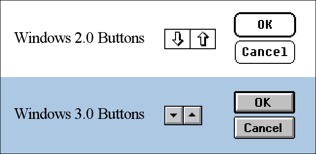
| ▲ | inigyou 5 hours ago | parent [-] | | Win3.1 style was completely flat and ugly though. | | |
| ▲ | ObscureScience 5 hours ago | parent [-] | | Are you thinking of Win 2.0?
https://static0.howtogeekimages.com/wordpress/wp-content/upl... | | |
| ▲ | sodapopcan 4 hours ago | parent [-] | | I think they must be? Windows 3.1 had depth. Win95 rammped it up in, what we all thought at the time, was a good way. I have this really fond memory of showing my friend (who is still one of my good friends in adulthood) who had installed XP that he could change the theme "back" to look exactly 95/98/2000. His reaction was this very earnest "I love this..." as he clicked around like he was experiencing again for the first time. Anyway, ya, getting a bit off topic into memory lane, but we just had cool UIs back then. |
|
|
|
|
| ▲ | spaghettifythis 5 hours ago | parent | prev | next [-] |
| Multi-row tabs are the primary thing I dislike about old UIs. You never seem to see them anymore, for which I am immensely grateful. Not only do they take up valuable vertical space, but they way the rows jump around always confused more than it really should have - a button shouldn't move after I click it, especially if it is representing state. |
| |
| ▲ | sodapopcan 4 hours ago | parent | next [-] | | My (admittedly spontaneous) thought was that we don't see them anymore because flat design make them almost impossible. Even with dividers, it would just look like a grid. I don't think that more-tabs-that-can-fit-on-one-"line" is ideal, but I think the modern equivalent - horizontal scolling tabs - is waaay friggin' worse. I've been confused by those before whereas the first time I encountered multi-row tabs in the "depth style," I had zero confusion about what I was looking at. | |
| ▲ | hdjrudni 4 hours ago | parent | prev [-] | | As opposed to tabs that either (a) get so small they're illegible, or (b) scroll off the screen so they're no longer accessible? The moving tabs issue we can fix but just not moving them. And the vertical space issue is much less of an issue now than it was then because we have higher resolutions but the answer to that is to start closing tabs when you can no longer see your content. It's like a quiet little nag that says you have too much stuff open. | | |
| ▲ | inigyou 2 hours ago | parent [-] | | The selected tab has to be on the bottom row for the visual metaphor to work, that's why they move. |
|
|
|
| ▲ | RedShift1 3 hours ago | parent | prev [-] |
| Not only flat design but also using less color. We have monitors and graphics cards that can display millions of colors now and we refuse to use it... Not that it has to look like a coloring book but sheez Windows 10 and 11 make me feel depressed. |