Remix.run Logo
theandrewbailey 6 hours ago

We've been getting flatter over time. Win9x (and even 3.x) styles have subtle 3D cues, like the edges of buttons, window borders, tabs, and text boxes. There were gradients. Apparently, these are technologies that we've lost.

inigyou 5 hours ago | parent [-]

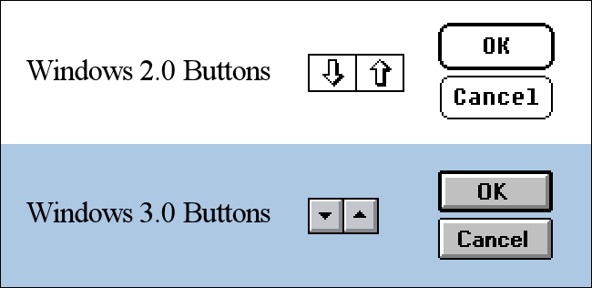
Win3.1 style was completely flat and ugly though.

ObscureScience 5 hours ago | parent [-]

Are you thinking of Win 2.0? https://static0.howtogeekimages.com/wordpress/wp-content/upl...

sodapopcan 4 hours ago | parent [-]

I think they must be? Windows 3.1 had depth. Win95 rammped it up in, what we all thought at the time, was a good way.

I have this really fond memory of showing my friend (who is still one of my good friends in adulthood) who had installed XP that he could change the theme "back" to look exactly 95/98/2000. His reaction was this very earnest "I love this..." as he clicked around like he was experiencing again for the first time. Anyway, ya, getting a bit off topic into memory lane, but we just had cool UIs back then.