| ▲ | The AI Aesthetic(blog.jim-nielsen.com) |
| 162 points by montroser 4 hours ago | 84 comments |
| |
|
| ▲ | jjcm 3 hours ago | parent | next [-] |
| > There are other aesthetics my brain associates with AI, like beige/cream colors, orange accents, and serif typefaces Something to consider regarding the narrow space AI-created designs align on: LLMs are trained to write consistent code. This makes sense for something like a billing or a backend function - you want that code to be consistent. The problem though is that LLMs write code to represent designs as well, which means you get consistent designs. You end up aligning on a generic mean because of it, which is often why you see these repeated aesthetics. It was something I saw when I was working on AI tooling over at Figma. It was very hard to get creative, unique outputs out of LLMs. One thing I'd recommend if you're trying to avoid this is try a diffusion model as a starting point. Gpt-image-2 is a VERY capable designer, and Opus and Fable are fantastic at converting images to webpages. Starting with images will let you sidestep a lot of the uniformity of output that LLMs have. I'm heavily biased here as this is what I left figma to build (https://news.ycombinator.com/item?id=48995754), but even starting with gpt-image-2 to give you a general sense of the look/feel will heavily differentiate you on the design front. Here are some examples of image->webpage outputs I've been playing with: https://html.non.io/tarot/ https://html.non.io/neonRamen/ |
| |
| ▲ | websight 2 hours ago | parent | next [-] | | I don't think these look "bad" exactly, but they do look like AI, and I don't think that's just because I know they are. | | |
| ▲ | Retr0id 2 hours ago | parent [-] | | I don't think I'd clock the ramen one as AI, if not for the main image being AI generated. | | |
| ▲ | gentoo 36 minutes ago | parent [-] | | They both read as hyper-polished pastiches of existing, well-established aesthetics. The cyberpunk one in particular employs just about every genre trope I can think of. There's no sense of stylistic ingenuity or choice - e.g. deliberately breaking from convention or leaving things out. |
|
| |
| ▲ | chadash 3 hours ago | parent | prev | next [-] | | I like your product and I’m gonna try it because I’m growing to hate the “Claude generated website aesthetic” but $0.13 is way too cheap. | | |
| ▲ | jjcm 2 hours ago | parent | next [-] | | Ha! Totally fair. 13 cents is 0% margin, which is what I'm targeting for individual plans. I literally just got my SOC2 compliance complete an hour ago, and I'm gonna roll out team plans/enterprise plans next week (unified billing + shared brands). For teams I'm gonna charge a flat 25% margin on API costs, and for enterprise I'll have a 50% margin + minimum spend. I think I'm going to keep the individual plans at 0% though. Realistically until my own diffusion models I'm training are the main model I'm using for generation, I'm just an API wrapper + harness. At the individual level I want to be competitive with going directly to the api and coding your own harness. I am curious though - what would you pay per image? | | |
| ▲ | chadash an hour ago | parent [-] | | Ok, so I signed in to your site and started out. The $0.13 is a bit misleading because by default it generates 4 images per “sketch” so it’s more like $0.50. So I can easily get to $5 in a session, which feels like a good amount. That’s about the amount I would pay to just play around and I like that you start me off with a few credits If I’m using this towards something that makes me money, I’d pay a lot more, but it really depends on context. In general, I’ll spend $5 like it’s nothing, $20 if it’s nothing and it’s for a business expense, and probably $50-100 for a design scheme for my (quite small) business. I don’t know that I’m a representative sample, but I’ll put my money where my mouth is, because I just added an extra $5 to play around more. Btw, it’s a really innovative interface. It’s fun and very different from other tools I’ve seen. I quite like it but it’s also a bit confusing. Feel free to contact me if you want customer feedback (info in profile). |
| |
| ▲ | altmanaltman 17 minutes ago | parent | prev [-] | | It literally is not though, it takes $0.50 for generating 4 images. That's on par for any image model by frontier labs. Probably just covering their costs right now but will keep rising it over time if the tool gets adopted. But it is not too cheap when you consider the sheer amount of variations one will make if they use this in a professional design capacity. The quality of the tool is not what this comment speaks on since i have not tried it yet but it is not "way too cheap" in any real sense given the pricing. |
| |
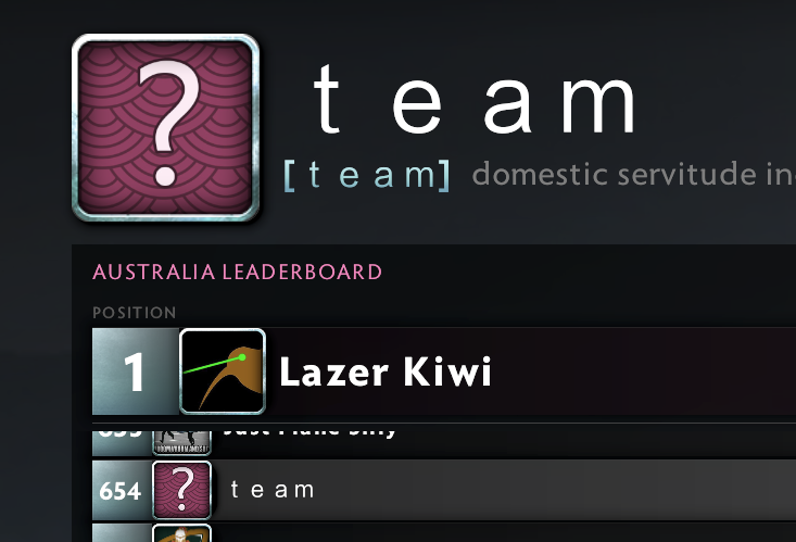
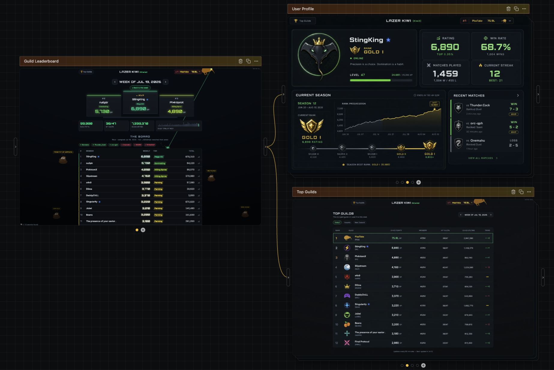
| ▲ | keithnz 2 hours ago | parent | prev | next [-] | | maybe, but you can do wacky things, eg I put together https://scores.lazer-kiwi.workers.dev/ It's a dota2 guild (#1 guild in autralasia) website and I have a bot that extracts the scores and publishes peoples progress on the website with a relatively basic table and stats, as a random side quest all kinds of weird stuff got built in ( you can shoot all kinds of things, if you hover over the number in the # column of the members and it turns into a gold sights, then you can click that and there are all kinds of weird cinematics. Lots of semi crude humor and Kiwi / Aussie rivalry Jokes and internal digs at some of the players. The art is...errr... basic. There's a secret counter down the bottom left so you can tell if you have seen all the weird things or not. Note, on mobile it doesn't include the extras. | | | |
| ▲ | floam 2 hours ago | parent | prev | next [-] | | I tried your tool just now, on my iPhone. I am really kind of stuck and frustrated. I cannot get that first box, the one you can type into, that’s on a grid into a state where I can interact with it. Stuff is jumping around after I try to move the canvas around, unexpected stuff. I can’t figure it out. | | |
| ▲ | jjcm 28 minutes ago | parent [-] | | Oof, apologies. I have not done any work at all on mobile to make this work. |
| |
| ▲ | internet2000 2 hours ago | parent | prev | next [-] | | The ramen one looks extremely AI. It's mostly the atrocious copywriting, and wonky responsiveness, but even overlooking those things you can tell. On the Tarot one, the 3D card in the bottom is both very elaborate and also pointless. No human would've put effort into making that. Not bad per se! But AI. | | | |
| ▲ | hijp 2 hours ago | parent | prev | next [-] | | For Tarot, did you generate base-color, roughness and normal maps? How do you make sure something like the roughness map doesn't deviate slightly from the base-color? | | |
| ▲ | jjcm 2 hours ago | parent [-] | | Yea. I have a very speed run version of how I made that one here: https://x.com/pwnies/status/2076755344471289898 But basically diffui's build step provides an API to create normal/roughness/depth maps from images. It's essentially an interface to fal.ai's Patina model, which does a really good job at creating those. The one thing that's missing with it though is metalness maps (Patina can theoretically output them, but they only have a ~10% success rate I've found). I'm trying to train my own diffusion model now to help generate those so the reflectivity isn't fully uniform. I just posted very, VERY early results here - right now my model has around a ~25% succes rate: https://x.com/pwnies/status/2082980850120163756 |
| |
| ▲ | sebmellen 3 hours ago | parent | prev | next [-] | | How do you prompt your diffusion models? I see that you are a founder in this space :) | | |
| ▲ | jjcm 2 hours ago | parent [-] | | A few layers to it. When you prompt on my product I expand out that prompt into a semantic json blob that represents the style, theme, color palette, and subjects on the screen. I then feed that blob into the diffusion model itself. The reason I feed in the json blob is it lets me better preserve subjects across multiple screens (ie you probably want to carry over the header exactly as it is in one image to another image). The example sites above though were pretty simple. I think they were something like "A tarot card website with an inky, painted artistic style, with rich illustrations on a card featured on the left, and a button to draw cards on the right" and for the other it was something like, "A cyberpunk inspired ramen cart website" |
| |
| ▲ | p-e-w 3 hours ago | parent | prev | next [-] | | > The problem though is that LLMs write code to represent designs as well, which means you get consistent designs. You end up aligning on a generic mean because of it, which is often why you see these repeated aesthetics. The funny thing is that looking like everyone else was once considered the definition of good UI design, because it helps users understand a new interface. Then mobile apps came and suddenly UI design was about “expressing your brand” or whatever. | | |
| ▲ | jjcm 2 hours ago | parent [-] | | I think it's important to separate patterns from aesthetics. Patterns help us understand a new interface for sure, but aligned aethetics start to look mundane. That's why I was specifically calling out the color usage and typefaces. I actually think the other things that Jim mentioned, such as the async task gradient / standard sidebar for agents are good things. |
| |
| ▲ | motoroco 2 hours ago | parent | prev | next [-] | | I wanted to try out your service but I don't have any accounts with Google or Microsoft properties (incl Github), so I can't sign up | |
| ▲ | senderista 2 hours ago | parent | prev | next [-] | | I was expecting Papyrus for the tarot page :) | |
| ▲ | wahnfrieden an hour ago | parent | prev | next [-] | | Context priming all the more important for design work over raw model vanilla experience | |
| ▲ | azan_ 3 hours ago | parent | prev [-] | | Honestly these examples absolutely DO look like generic AI slop, no offense. | | |
| ▲ | a1o 3 hours ago | parent | next [-] | | I think that if the images were replaced by human made (you can take photos of real things if you don’t want to draw or hire an actual artist) perhaps the design could be more passable | |
| ▲ | matheusmoreira 2 hours ago | parent | prev [-] | | I think the neon ramen example looks pretty awesome. | | |
| ▲ | jjcm 2 hours ago | parent | next [-] | | ty ty, though I do agree with azan that the imagery inside of it looks generated (as it is). That was really a test of whether or not newer models could implement box shapes that aren't provided by CSS. Opus 5 was one of the first that really nailed that - it's been a long standing test I've had for img->html. | |
| ▲ | shimman 2 hours ago | parent | prev [-] | | It's a copy of cyberpunk 2077 aesthetic (which if you search on google you'll see many css + component libraries trying to recreate it). |
|
|
|
|
| ▲ | gitgud 10 minutes ago | parent | prev | next [-] |
| Good UX abstractions out perform bad ones, which means they endure, are copied, and eventually become the implied standard UX… some examples of this are; the hamburger menu, tiny icons and auto-scroll for streaming text |
|
| ▲ | baubino 2 hours ago | parent | prev | next [-] |
| > There are other aesthetics my brain associates with AI, like beige/cream colors, orange accents, and serif typefaces First, they took my em dash. Now, they’re taking my neutral background with orange accents. |
| |
| ▲ | ValentineC 2 hours ago | parent | next [-] | | Beige/cream colours and orange accents — wait, isn't that literally the HN design? (Randomly, I love the Solarized colour schemes, so anything similar is great, vibe-coded or not.) | |
| ▲ | monk_grilla 22 minutes ago | parent | prev [-] | | They first starting appearing after Fable in my memory. The first HTML docs I generated with Fable had that cream serif with orange highlight look. I thought it looked awesome until I saw it on every other vibe-coded website... |
|
|
| ▲ | aenvoker 40 minutes ago | parent | prev | next [-] |
| Web devs gonna focus on web dev things. But, I’m more interested in the works of artists like https://www.rooperainisto.com/ and https://andreaciulu.com/ who embraced the glitchy aesthetic of early AI image generation and made it integral to their art instead of fighting it. |
| |
| ▲ | rsoto2 4 minutes ago | parent [-] | | lol this is actually my art(slop). I "prompted" it from the internet and it materialized on my screen. I own it, please don't misattribute it. |
|
|
| ▲ | saretup 8 minutes ago | parent | prev | next [-] |
| > AI = sparkles and rainbow colors — it’s funny when you think about it Never seen anyone use rainbow emoji to convey AI |
|
| ▲ | guessmyname 3 hours ago | parent | prev | next [-] |
| > For example, there’s the hamburger menu (≡) which saw a proliferation during the rise of mobile due to the constraints around screen size. Speaking of this, GitHub replaced theirs with a pancake emoji. Maybe related to the stacked pull-requests announcement earlier today. |
| |
| ▲ | dd8601fn 19 minutes ago | parent | next [-] | | Some sites use “the waffle”. Weird that they’re all food. | |
| ▲ | genghisjahn 3 hours ago | parent | prev | next [-] | | That’s what that was. I thought someone there screwed up an image path. | |
| ▲ | a1o 2 hours ago | parent | prev [-] | | Did they write anywhere about it? I noticed it - and I think it uses the system emoji, because I noticed the pancake was different between my systems. | | |
|
|
| ▲ | dgunay 3 hours ago | parent | prev | next [-] |
| There's definitely a lot of AI-generated websites, especially for dev tools & SaaS, that love to have dark backgrounds, cool colors (purple especially is making a resurgence it seems), and tons of fancy UI widgets. |
|
| ▲ | omoikane an hour ago | parent | prev | next [-] |
| I thought this article was going to be about graphical imagery as opposed to textual elements. I was specifically thinking about certain levels in Pragmata where they had this somewhat broken and inconsistent look that was meant to resemble AI-generated imagery, but was actually all done manually: https://www.ign.com/articles/pragmata-contains-a-stage-thats... |
|
| ▲ | AsyncBanana 3 hours ago | parent | prev | next [-] |
| A lot of these things are continuations of previous trends too. The shimmering text effect is strongly reminiscent of skeleton UI, only repurposed for chat interfaces. As always, design is more continuous evolution than discrete shifts. |
| |
| ▲ | data-ottawa 2 hours ago | parent | next [-] | | I actually like the shimmer effect, I think it’s preferable to almost all spinners. If the agent is set up to properly show intent then this is better than spinners or exponentially decreasing loading bars. | | | |
| ▲ | collingreen 3 hours ago | parent | prev [-] | | As the saying goes: Slowly, then all at once. | | |
|
|
| ▲ | paxys 3 hours ago | parent | prev | next [-] |
| This is mostly just the 2010-2024 SaaS aesthetic. AI was trained on it and so is picking it up. |
| |
| ▲ | causal an hour ago | parent [-] | | Yeah. Though I wonder how capable AI is of evolving past? Especially as the content it outputs fortifies the training data that gets scraped. |
|
|
| ▲ | fidotron 3 hours ago | parent | prev | next [-] |
| The defining "AI" aesthetic is the TUI, for better or worse. The real question is what the post-AI aesthetic will be, and at a guess it will bifurcate into obsessive recreations of earlier happier pre-AI times, and some sort of opposite extreme of videos of Chinese cities covered in LEDs. |
| |
| ▲ | ainch 3 hours ago | parent [-] | | Perhaps amongst coders, but I doubt most users are interacting with TUIs - my retired mother uses ChatGPT most days, but I suspect it'll be a while before she downloads Claude Code. |
|
|
| ▲ | blfr 2 hours ago | parent | prev | next [-] |
| I think that most early AI aesthetic will go the way of bootstrap and become associated with ultra utilitarian software where no one thought about intentionally making a design. Fable can easily generate something like a design system for itself from whatever starting point you give it. So if you want different aesthetic, you can bang out the aesthetic first in Claude Design and then serve it to Claude Code to follow. It will follow. |
| |
| ▲ | smoe 2 hours ago | parent | next [-] | | I would say by default, the AI aesthetic is the opposite of utilitarian. It adds so much unnecessary bits and bobs everywhere, random things that look reasonable at first glance but often are nonsensical noise. The visual equivalent of the endless yapping in chat. For me it was a lot of work with Fable to keep it focused on producing a minimal, medium-high information density system. Sure, it works very well if you are just IP laundering another product, less so for more niche applications. Still super useful, but I haven't seen it produce much "intentional" design on its own. | |
| ▲ | john01dav 2 hours ago | parent | prev [-] | | I disagree because they communicate different things (to me). Seeing Bootsrap for some custom software at my university pre-llm: "I think that a programmer made this and didn't have a designer helping them so they just used a library" Seeing vibe-coded frontend: "This app may be entirely vibe coded so I am deeply suspicious of it, or it could be a programmer who didn't have a designer helping them and thus used Bootstrap" |
|
|
| ▲ | hmokiguess 3 hours ago | parent | prev | next [-] |
| Tangent but, I still know plenty of people who are not aware of the "hamburger menu" and also do not know it as such or reference it as such. The bubble in tech is pretty strange but I digress |
|
| ▲ | j_aime 19 minutes ago | parent | prev | next [-] |
| My bathroom break was longer than that article. |
|
| ▲ | firasd 2 hours ago | parent | prev | next [-] |
| An irony to this is that the front-ends generated by older models are gonna end up looking distinctive. If you rock a Claude Sonnet 3.7 (or was it Sonnet 4) mid-2025 purple gradient background forever you've set yourself well apart |
| |
| ▲ | left-struck 34 minutes ago | parent | next [-] | | Oh no, I just realised we’re going to have a nostalgia wave for old school AI in 20 to 30 years. Well maybe not you and I but it’s gonna happen. | |
| ▲ | olalonde 2 hours ago | parent | prev [-] | | Would be cool to have models trained on specific eras of design, a bit like that LLM which was exclusively trained on pre-1931 text. |
|
|
| ▲ | A_D_E_P_T 3 hours ago | parent | prev | next [-] |
| > before AI what were the connotations of the sparkle emoji ? It generally stood for either: - fireworks (combined with other firework emojis,) - birthdays/festivals (next to the birthday cake and "party popper" thing emoji,) - magic (next to the wizard or wand, which features almost identical sparkles) It was pretty festive. Now it's just AI, lol. |
|
| ▲ | Centigonal 3 hours ago | parent | prev | next [-] |
| Another AI-ism is the use of the word "grain" in technical contexts. I'm confident the OP is human-written, but everything in my AI-supported codebase is about grains, seams, tracer bullets, and load-bearing components now. I'd barely heard some of these words before, and now they're everywhere. It's like everyone suddenly has a friend who speaks in the same idiosyncratic way, and we're all picking up their vocal stims. |
| |
| ▲ | anon373839 an hour ago | parent | next [-] | | > everything in my AI-supported codebase is about grains, seams, tracer bullets, and load-bearing components Oh no. I'm afraid you may have neglected to do smoke tests. | |
| ▲ | fidotron 3 hours ago | parent | prev [-] | | This has been a growing problem with humans for a while. Go back ten years and use "guardrails" or "top of mind" in a conversation and you'll get baffled looks. For whatever reason the fad based enthusiasm for semi jargon is a widespread affliction. In the english speaking world the political sides are even becoming unsubtly linguistically distinct. You can tell which way someone votes by their choice of vocabulary. |
|
|
| ▲ | aetherspawn 3 hours ago | parent | prev | next [-] |
| The tiny icons are good. There was a touch device fad that surfaced, and is subsequently dying, now that people realise that using laptop screen realestate more efficiently helps those doing actual work. |
| |
| ▲ | strictnein an hour ago | parent [-] | | Agreed. Maybe I'm in the minority, but in the screenshot comparisons I greatly preferred the AI products. The Mac OS stuff seems bloated. | | |
| ▲ | SyneRyder 32 minutes ago | parent [-] | | I had the same reaction as well, the macOS designs looked busy and cluttered. I was surprised that AI companies had landed on something more refined. If nothing else: why is the left sidebar in macOS Liquid Glass on a raised panel? There's no need for it, and that's a whole round-rect of unnecessary visual clutter that can be removed. |
|
|
|
| ▲ | ajkjk 2 hours ago | parent | prev | next [-] |
| For as long as the sparkle emoji has been in use I have taken it to be a red flag, the telltale sign of "buttons not to click". I can't imagine how a designer could justify including it at this point. |
| |
| ▲ | soupspaces an hour ago | parent [-] | | And worse it's usually next to the search button or might even activate itself as "helpful" assistants |
|
|
| ▲ | cortesoft 3 hours ago | parent | prev | next [-] |
| Is the "'shimmering text' for waiting" thing really that recent? I feel like that is a bit older, but maybe I am wrong. I have more and more difficulty remembering how long things have been around as I get older. |
| |
| ▲ | dd8601fn 11 minutes ago | parent [-] | | Me too, but I suppose something had to be somewhat popular for llms to regularly put it in design artifacts, now. |
|
|
| ▲ | anon373839 3 hours ago | parent | prev | next [-] |
| How could an article on the AI aesthetic not mention the curiously anatomical company logos? On a more serious note, I like the tiny icon trend as depicted in the article. Those little icons next to menu text are pretty ornamental, and don't need to be as big as they usually are. |
| |
| ▲ | piskov 3 hours ago | parent | next [-] | | The issue with the icons is not the diameter but their stroke thickness — it should be the same as the letters. | | |
| ▲ | anon373839 3 hours ago | parent [-] | | Oh, huh. I was focused on the scale but you’re right, they are kind of wispy. That reminds me of the anorexic typography trend from ~2013. It’s probably intended to convey sophistication. |
| |
| ▲ | Waterluvian 3 hours ago | parent | prev [-] | | The nice thing about web and electron apps is you generally get zoom for free. I like the icons as they just kind of work better for my brain. | | |
| ▲ | dpark 8 minutes ago | parent [-] | | I really hope AI is going to help turn the tide from this “everything runs a copy of chrome” architecture. It’s never been cheaper to build fast native UIs than right now, but everyone is still shipping web apps wrapped in chromium. |
|
|
|
| ▲ | andy_ppp 3 hours ago | parent | prev | next [-] |
| I think the article means the seahorse emoji, as we all know the unicorn emoji doesn’t exist. |
|
| ▲ | ayaros 2 hours ago | parent | prev | next [-] |
| > They should’ve just thrown unicorns in there for the trifecta Ah, unicorns. We've seen plenty of them throughout the AI bubble. Very apropos. |
|
| ▲ | ltbarcly3 3 hours ago | parent | prev | next [-] |
| There are like 43 tiny icon libraries and frameworks for web design. AI didn't start this trend at all. This article is just "put AI in the title and it will get attention" and apparently it works. |
|
| ▲ | cyanregiment 3 hours ago | parent | prev | next [-] |
| Uhh what? So shadcn, bad devs using small icons and antialiasing - I think this is all peripheral to AI aesthetics. Midjourney has a definite aesthetic. Minimax has one. Stable Diffusion definitely (ugly, but free ) Sora everything is rendered in Octane lol If it’s cartoon or animated it’s Ghibli. I have not noticed “orange” as a particular AI trend. |
|
| ▲ | nader 4 hours ago | parent | prev | next [-] |
| agree! |
|
| ▲ | yieldcrv 2 hours ago | parent | prev [-] |
| loooooooooooong landing pages is a sure tell sign of vibe coded slop, the new geocities “you know what, ten more sections to get the point across is absolutely the right move, you’ve nailed it, and frankly, that’s rare” |
| |
| ▲ | blt an hour ago | parent [-] | | Yep, same with code, the models are always verbose by default. Conincidentally, the output is charge per token. Another one is a table of contents in something short. |
|