| ▲ | sph 4 days ago |
| Stupid question for colour-blind gamers: why do accessibility options in games remove and mute colours to simulate colour blindness types? (i.e. protanopia, deuteranopia, etc.) I imagine if you can’t perceive some colours, you want hue shift or boost, not to actually remove colours so it looks like what you already are seeing. Feels a bit like muting all sounds to help one with auditory deficiencies. What am I missing here? |
|
| ▲ | PetitPrince 4 days ago | parent | next [-] |
| You're missing nothing, that's just a badly designed feature (hello Doom 2016). Or rather a badly named feature. To give the benefit of doubt: maybe it's a simulator that the dev used for testing that got left in production ? |
| |
| ▲ | sph 4 days ago | parent [-] | | Yes I always felt those accessibility options are actually simulation options for non-colourblind people, and no one uses them. I’ve seen them in half a dozen games though, so it cannot be really a mistake. | | |
| ▲ | stodor89 2 days ago | parent [-] | | I know non-colorblind people who play League of Legends with colorblind settings turned on. Dunno what to make of that. |
|
|
|
| ▲ | MathMonkeyMan 4 days ago | parent | prev | next [-] |
| Suppose you can distinguish 16 colors. Somebody else can distinguish only 4. To accommodate the sees-only-4-colors person, you need to make sure that game elements are not differentiated by colors that look the same to the sees-only-4-colors person. One way to do this is to choose a color palette having only 4 colors and designing the game to still make sense that way. Also make sure that sees-only-4-colors can distinguish the 4 colors you chose. |
| |
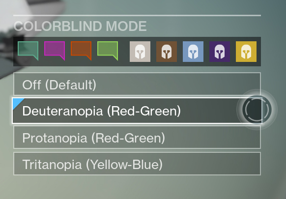
| ▲ | sph 4 days ago | parent [-] | | Is it though? This is the deuteranopia (red-green blindness) option in Destiny https://www.gamersexperience.com/wp-content/uploads/2016/07/... The red and green icons are still prominently there. If one is red-green blind, shouldn’t those icons be any other hue than green and red? | | |
| ▲ | itishappy 4 days ago | parent | next [-] | | They've moved them away from being pure red/green, but more importantly they made one lighter and the other darker. Everybody can detect lightness! | |
| ▲ | pchangr 4 days ago | parent | prev [-] | | I believe the red-green blind means you can’t distinguish between different shades of red and green ., not that you can’t see red and green.
So you’re safe as long as you’re not using multiple red and green shades |
|
|
|
| ▲ | itishappy 4 days ago | parent | prev [-] |
| Boosting contrast won't help you if you can't tell the difference, so you actually want to shift colors away from the ambiguous axis. This necessarily has the effect of removing certain colors. |
| |
| ▲ | edejong 4 days ago | parent | next [-] | | Not exactly. It’s not that I can’t see the colors, I just need more contrast to pick up red or green. A grayish green looks the same as plain gray to me. A small bright green dot? Might as well be gray or brown. But a large, solid area of bright green or red? No problem at all. | | |
| ▲ | itishappy 4 days ago | parent [-] | | Same here. I can figure it out, just not at a glance. Unfortunately, when it comes to video games, identifying small flashing colors at a glance is exactly the goal. |
| |
| ▲ | ashoeafoot 4 days ago | parent | prev [-] | | You can also overlay hints, for example different shadow ditherings depending on color ? Im actually pro ambivalent colors as this is what feels natural for somebody color mismatching. | | |
|