| ▲ | elwebmaster 3 hours ago | |||||||
Notice how everything is logical, thinking has gone into the usability of every control and embedding information into its state. I can't say the same for modern design. | ||||||||
| ▲ | biofox an hour ago | parent | next [-] | |||||||
How do we get back to this? I want logical interface standardisation in my life. | ||||||||
| ▲ | darkwater 2 hours ago | parent | prev | next [-] | |||||||
What is more important / most used between "Click me" "Submit query" "Reset" in the very first Button example? Everything of the same grey, nothing stands out, but there is usually a most used button. | ||||||||
| ▲ | netsharc 2 hours ago | parent | prev [-] | |||||||
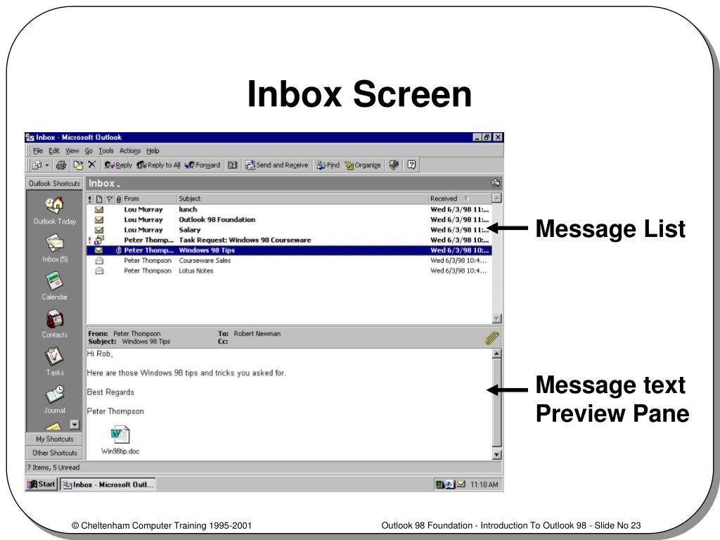
Outlook 98 (is it Copilot for Communication 365 ProMax now?) looked like this: https://image3.slideserve.com/6380850/inbox-screen-l.jpg At some point it changed to the minimalist flat layout. I was staying at a hotel and the nice old receptionist mentioned to me he somehow messed up the sorting of the emails from "newest e-mail on top of the list" and couldn't find how to change it back. I pointed to him the text "Received" which seemed to be just floating in the middle of nowhere... | ||||||||
| ||||||||