| ▲ | croemer 4 hours ago | |
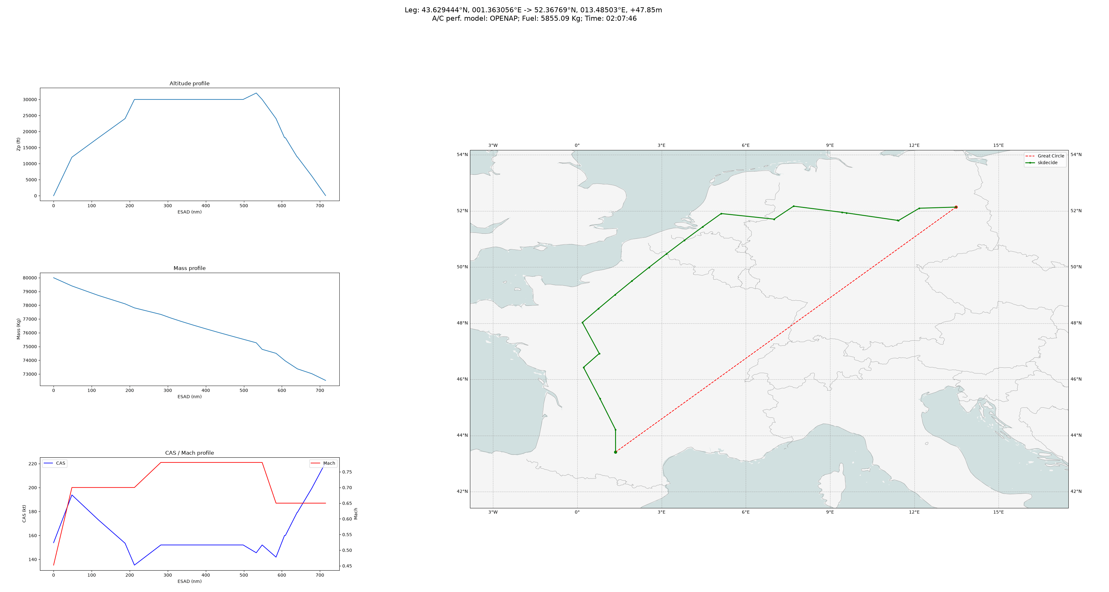
If you look at the "optimal" path here looks completely unrealistic/pathological. How is it optimal to zig zag like this? The grid is clearly too coarse and that's possibly not the only issue: https://tech.marksblogg.com/theme/images/flight_planning/msr... | ||
| ▲ | cobbzilla 3 hours ago | parent [-] | |
I think it’s not a great illustration; the map looks like mercator so the shortest path would be curved and closer to the green path anyway. the red line is not “as the crow flies”. It would be more fair to show deviation from the actual (great circle) shortest path. Also agree the grid seems coarse. | ||