| ▲ | al_borland 2 hours ago | |
We do agree. I said the first thing you quoted was the wrong approach, because of the second thing you quoted. Having it say “start”, like it used to, would help solve that. | ||
| ▲ | ConceptJunkie 31 minutes ago | parent | next [-] | |
For people complaining that "Start" isn't a great choice, perhaps there's something better, but I can't think of anything. You need a small word that implies, "Click here to do something or find something." and in that regard, I think "Start" is a good choice. On the other hand, I think there were few ideas worse than "My Computer", etc., not the least of which is the fact that it took Windows application software about 10 years to get consistently good at handling paths with spaces in their names. Of course, the worst UI thing Microsoft ever did was hiding file extensions by default. That might be the worst UI decision in all of history. | ||
| ▲ | ranger_danger an hour ago | parent | prev [-] | |
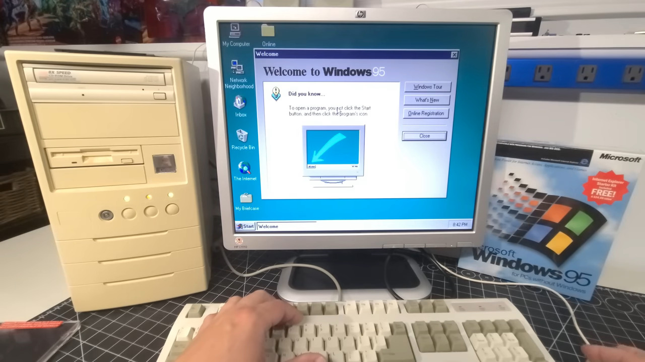
Ok but, were you around during that time? I remember it not helping much at all to tell people what to do. When Windows 95 first came out, they had to have a giant arrow pointing to the Start menu with an explanation of what that would do: https://a.imagem.app/Ge6OCZ.jpeg Then they had a scrolling animation with an arrow and some text ("Click the Start button to begin") that slid in from the right side of the taskbar and pointed right at the Start button. | ||