| ▲ | Vacuum-Form Signage(bethmathews.substack.com) | |||||||||||||
| 58 points by benbreen a day ago | 11 comments | ||||||||||||||
| ▲ | Animats 5 hours ago | parent | next [-] | |||||||||||||
"That's what a Vac-U-Form can do!"[1] TechShop used to have a medium sized vacuum forming machine, but it was lost in one of their moves. Those are useful for tool trays. Lay down all the tools for some kit, vacuum-form a tray, and put the tray in a case for the kit. Often used in aerospace, where you want to make sure nobody left a wrench inside the engine or fuel tank. | ||||||||||||||
| ||||||||||||||
| ▲ | EvanAnderson 5 hours ago | parent | prev | next [-] | |||||||||||||
I grew up seeing these signs all over and never gave them a thought. I love articles that bring something to my attention that I never thought to think about. Aside: If you are a sign aficionado the American Sign Museum in Cincinnati will make you very happy: https://www.americansignmuseum.org/ | ||||||||||||||
| ▲ | msuniverse2026 an hour ago | parent | prev | next [-] | |||||||||||||
Oh wow, just got my first age-verification redirect because I'm Australian and the 'online safety act' is kicking in. Welp. | ||||||||||||||
| ||||||||||||||
| ▲ | JSR_FDED 5 hours ago | parent | prev | next [-] | |||||||||||||
Signage has such a huge impact on how we experience an environment, the vibes it gives off. Comparing the US and the Netherlands - the US seems much more chaotic and organic than the Netherlands with its unified government standard typeface. | ||||||||||||||
| ||||||||||||||
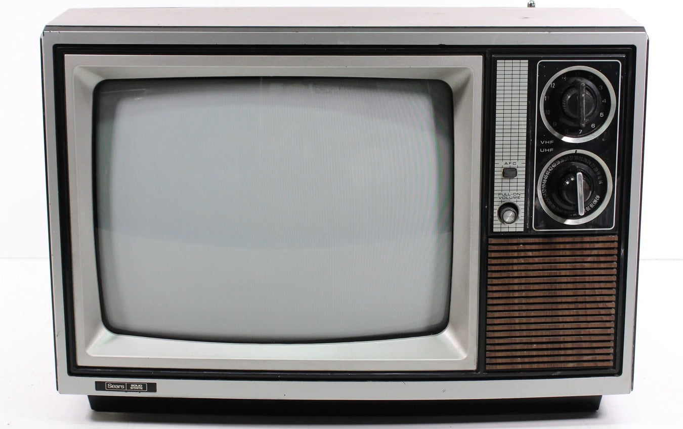
| ▲ | userbinator 3 hours ago | parent | prev | next [-] | |||||||||||||
Something about that rounded-rectangle shape is evocative of the YouTube logo - perhaps I was primed towards that as one of the signs shown is advertising "TV's". | ||||||||||||||
| ||||||||||||||
| ▲ | bigbuppo 5 hours ago | parent | prev [-] | |||||||||||||
This is great. I've been wondering about these for decades. | ||||||||||||||