| ▲ | ray_v 2 days ago |
| If I ever encounter, and need to read a webpage with arbitrarily sized and placed grids of text, please somebody just shoot me.
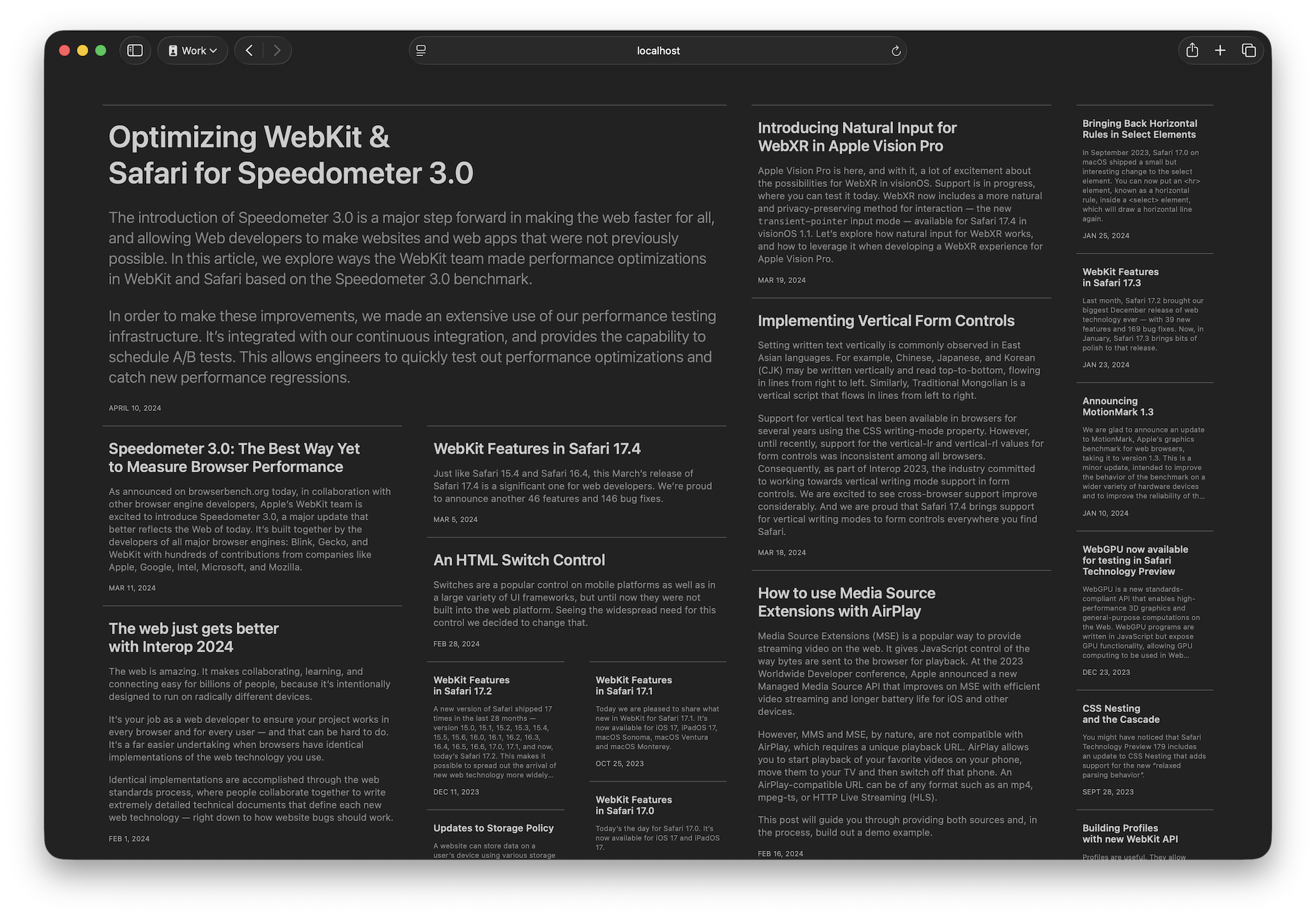
https://webkit.org/wp-content/uploads/Grid-Lanes-newspaper-d... |
|
| ▲ | satvikpendem 2 days ago | parent | next [-] |
| Never read a newspaper? |
| |
| ▲ | netsharc 2 days ago | parent | next [-] | | (Not GP poster.) I don't really have a problem with masonry layouts, but a newspaper is limited by the paper size and they have incentive to squeeze everything in there (to maximize the spread of "information"). The screen is theoretically infinite (although not for kiosks). I do have a website with a lot of images, and at the moment everything is in a 3-across grid layout... | | |
| ▲ | satvikpendem 2 days ago | parent [-] | | The screen is infinite but information should still be prioritized, that is why newspapers use different sizes of headings. If they truly wanted to jam everything in there, they'd use the same small font size and save on paper, but that's not what people like because they want to see at a glance what is important and what's not, and that's done by the font size initially. This is no different on an infinite screen, the design principle of information prioritization still holds. |
| |
| ▲ | ray_v 2 days ago | parent | prev [-] | | Yes, I have. Printed, which is fundamentally, and literally a different media type with different properties | | |
| ▲ | satvikpendem 2 days ago | parent [-] | | Someone else said the same thing which I addressed here: https://news.ycombinator.com/item?id=46331586#46334242 TLDR: in the user's eyes, a newspaper and this sort of layout are not very different, if the average user can navigate the former for hundreds of years, they can navigate the latter. | | |
| ▲ | ray_v 2 days ago | parent [-] | | Ok, but the fact of the matter is that a digital display rendering a webpage and a physical format of a newspaper are fundamentally different media and should be treated as such. A wall of text isn't fundamentally a bad thing, but on a display monitor (or god help you, a cellphone or tablet) that's a terrible user experience. | | |
| ▲ | satvikpendem 2 days ago | parent [-] | | Sure, you can treat them differently, but for certain use cases and layouts, you can treat them the same. It all depends on what you're trying to do. |
|
|
|
|
|
| ▲ | meesles 2 days ago | parent | prev | next [-] |
| I agree, this seems to violate some of the most fundamental concepts of design like least-surprise and using grouping + alignment to give context to readers. |
|
| ▲ | jlaternman 2 days ago | parent | prev | next [-] |
| I think this looks great too. Finally replicating the efficiency of newspaper layouts. No enforced symmetry, just content in an optimal space. I want. |
| |
| ▲ | snackbroken 2 days ago | parent | next [-] | | It looks pretty, but fails at basic usability. After reading the top-left block of text titled "Optimizing Webkit & Safari for Spedometer 3.0", what the fuck am I supposed to read next? Am I meant to go recursively column by column, or try to scrutinize pixels to determine which of the blocks are further up than the others, skipping haphazardly left and right across the page? A visual aid: https://imgur.com/a/0wHMmBG Columnar layout is FUNDAMENTALLY BROKEN on media that doesn't have two fixed-size axes. Web layouts leave one axis free to expand as far as necessary to fit the content, so there is no sane algorithm for laying out arbitrary content this way. Either you end up with items ordered confusingly, or you end up having to scroll up and down repeatedly across the whole damn page, which can be arbitrarily long. Either option is terrible. Don't even get me started on how poorly this interacts with "infinite scroll". | | |
| ▲ | zozbot234 2 days ago | parent | next [-] | | > Columnar layout is FUNDAMENTALLY BROKEN on media that doesn't have two fixed-size axes. You can use plain old CSS columns (which don't have the automated "masonry" packing behavior of this new Grid layout, they just display content sequentially) and scroll them horizontally. But horizontal scrolling is cumbersome with most input devices, so this new "packed" columnar layout is a good way of coping with the awkwardness of vertical scrolled fixed-width lanes. | |
| ▲ | satvikpendem 2 days ago | parent | prev | next [-] | | > what the fuck am I supposed to read next? What a weird comment. You read whatever you want next, ever read a newspaper? You scan it all and pick the article you are interested in, then read that. I don't understand these comments, they work perfectly well in real life (and fixed size is arbitrary, I can make a super wide or super long newspaper too, the axis size does not affect this sort of layout, see infinite scroll for example, as there is only a fixed amount of content on the screen at any given time). | | |
| ▲ | snackbroken 2 days ago | parent | next [-] | | > You scan it all and pick the article you are interested in Okay. What order am I supposed to scan in so I don't lose my place and accidentally skip a block? Scanning column by column gets me cut off partial boxes that I'll have to remember to check again later, while scanning side to side forces me to keep track of each individual block I've already looked at, as opposed to a single pointer to "this is how far I've scanned". Alternatively, I can scan roughly left to right, top to bottom and just live with missing some blocks. That's not ideal either, because hopefully if you didn't think I'd like to look at all of them you wouldn't have included them on the page. You're right that you can make a newspaper that's really inconvenient to read, but you wouldn't, because the failure case you'd end up with is CSS Grid Lanes. | | |
| ▲ | satvikpendem 2 days ago | parent [-] | | This is so funny that I'm not even sure what to say. You can ask your exact questions about a newspaper but somehow 99% of people manage to read them just fine. I think it's just a you problem that you are looking for an exact algorithm on how to scan a page with multiple sizes of content; in reality, people just look over it all and keep track of what they have or haven't looked at all in their heads. | | |
| ▲ | snackbroken 2 days ago | parent [-] | | In a newspaper the answer is simple. You linearly scan the leftmost column to the bottom of the page, then the next column, then the next, and so on until you get to the end of the page. At no point do you ever need to keep track of anything other than "this is how far I've gotten" to make sure you haven't missed anything. Columnar layout make sense in newspapers because both axes are fixed in size, so all you ever do is one long linear scan with wraparound. | | |
| ▲ | satvikpendem 2 days ago | parent [-] | | If one axis is fixed, and it is in the case of grid lanes (it's not a fully pannable infinite canvas like Figma after all), you just keep reading the content that's on the current screen, then you scroll. I really don't see how it's any different to, for example as I mentioned previously, a long newspaper with many pages; each "page" is one "screen" worth, analogously. It's like infinite scroll, either vertically or horizontally, where instead of just one item in the list, you have a few. And if we're being really pedantic, Figma users do perfectly fine keeping the context of the content in their minds even in an infinitely pannable canvas. And also, generally newspaper readers do not do what you say, scanning column by column, they instead glance their eyes over all of the headlines then pick which one looks good then they read the article attached to that, it is a free form process. So again, I will contend that this is not a problem for the average reader. I really cannot see where the difficulty you seem to say lies. |
|
|
| |
| ▲ | 2 days ago | parent | prev [-] | | [deleted] |
| |
| ▲ | atoav 2 days ago | parent | prev [-] | | Well not all content is meant to be read in order. A layout like this is good for content where you want to incentivise users to read in whichever order you like. So if the order is confusing you, chances are there wasn't meant to be any order at all. E.g. if you search google images google guesses some relevant order for you, but it is layed out in a dense way so you can scan with your eyes and decide which thing is most relevant for you. Whether you scan the screen left-right, top-down, randomly, bottom up, or ehatever is totally your choice. Using such a layout for a novel or something like this would be really bad UX. But using it for an image gallery? Or a series of random articles that aren't priorized? Why not? |
| |
| ▲ | 2 days ago | parent | prev [-] | | [deleted] |
|
|
| ▲ | 2cynykyl 2 days ago | parent | prev | next [-] |
| Funny, I think that looks gorgeous! |
|
| ▲ | 65 2 days ago | parent | prev | next [-] |
| NYTimes.com comes to mind... |
|
| ▲ | arewethereyeta 2 days ago | parent | prev [-] |
| what's your problem? |