| ▲ | nixosbestos 4 days ago | |||||||||||||||||||
> Admittedly, this was maybe 5 years ago. Hahhaha, absolutely classic linux on HN post. Couldn't be better written satire. Except that I guess you at least acknowledged it. Which non-abandonded OS/DE hasn't significantly changed in 5 years? I can't think of one. Maybe GNOME, but they were early movers and everyone hated them for that. | ||||||||||||||||||||
| ▲ | pxoe 4 days ago | parent | next [-] | |||||||||||||||||||
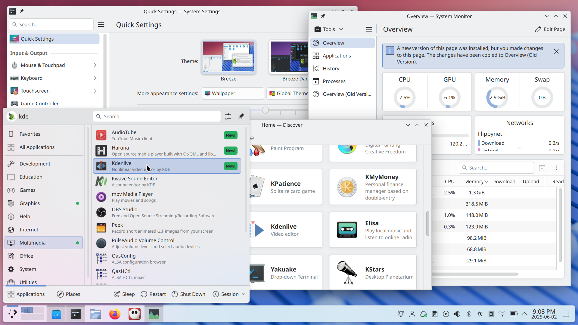
Looking at a screenshot from KDE home page, it really does not seem like anything has changed with it in terms of design polish that much. It doesn't even seem like it's moving in a direction that's any different. https://kde.org/announcements/plasma/6/6.4.0/fullscreen_with... The most significant change for the whole look they could make is changing the system font, because that's the biggest and most visible thing, and the one they have looks amateurish and makes it feel slapdash, like it was an afterthought, just picking whatever default font there was and going "whatever", which kind of ends up being the vibe of the whole thing. | ||||||||||||||||||||
| ||||||||||||||||||||
| ▲ | eviks 4 days ago | parent | prev [-] | |||||||||||||||||||
> Which non-abandonded OS/DE hasn't significantly changed in 5 years? Followed by a classic HN comment: the question was about improvement, not change! | ||||||||||||||||||||