| ▲ | rramon a day ago |
| They went way too far with the corner radii and pill shapes imo, looks like a Fisher Price toy. Some inner buttons retained the old radii and don't match the outer window radii anymore. |
|
| ▲ | sys_64738 21 hours ago | parent | next [-] |
| It's truly hideous to look at. I really can't believe they went for these massively rounded corners. They're too stubborn to allow you to select an option for right angled corners again. They just tinker as there's no other real UI enhancements. |
| |
| ▲ | creddit 18 hours ago | parent | next [-] | | > They're too stubborn to allow you to select an option for right angled corners again. "right angled corners again" I have a feeling you aren't and haven't been a Mac user for a long time. When was the last time Macs had right angled corners!? 30+ years ago? | | |
| ▲ | redwall_hp 43 minutes ago | parent | next [-] | | Literally never. System 1 has corners that are superficially pointy looking, but if you look close they have a sort of smoothing instead of being a hard right angle. On a screen with 340 lines of resolution. | |
| ▲ | al_borland 4 hours ago | parent | prev [-] | | I think it was in the Steve Jobs biography (or maybe I read it somewhere else), that Jobs made them do rounded corners on the windows back on the first Macintosh after noticing the rounded corners on a table they had. The engineers complained about how much extra memory that would take on such a limited system, but they figured it out. |
| |
| ▲ | al_borland 4 hours ago | parent | prev [-] | | Whenever I see people try to make their Linux environment look modern and fancy, they generally include extremely rounded corners. |
|
|
| ▲ | cosmic_cheese a day ago | parent | prev | next [-] |
| It’s a trend that’s visible in other designs too, like Material 3 Expressive. I’m not a fan of Windows but I believe that probably the best modern UI design system for desktops right now is probably the flavor of Fluent used in Windows 11. It still retains somewhat desktop-like information density, doesn’t go overboard on radii, and has a touch of depth. I’d like to see more design languages exploring in its general direction. |
| |
| ▲ | bayindirh 19 hours ago | parent [-] | | I still find KDE superior in productivity, information density and "useful effects" category. Apple still has the best "get out of the way, be invisible" UI. Both are valid ways to approach to a problem, but I like KDE's batteries included, infinitely customizable way better. | | |
| ▲ | cosmic_cheese 19 hours ago | parent | next [-] | | I think KDE has the right spirit but its execution leaves something to be desired. | | |
| ▲ | bayindirh 19 hours ago | parent [-] | | I don't think "defaults to windows-like" is a bad choice for newcomers. I don't customize it heavily either. Move tray, clock and menus to the top, a-la GNOME2, leave taskbar at the bottom, both auto-hidden and narrower than screen. Add four desktops as a 2x2 grid, re-enable old CTRL+ALT+$ARROW keyboard shortcuts, add a couple of usability effects with custom key combinations and two active corners, and I'm done. Some applications (Konsole, KATE) get custom fonts and themes, but everything else is bog standard. Setting it up takes 30-ish minutes, and it's the same config for decades now. Probably because of sharpening the same tool and optimizing without knowing. Then, I can just concentrate and fly on that environment. Also, they have improved a lot in the small areas where it was lacking. You can use your system without a terminal if you want, plus Baloo works really well. | | |
| ▲ | cosmic_cheese 18 hours ago | parent [-] | | I would argue that it actually doesn’t go far enough in windows-like-ness to be viable for a lot of people, and for those who prefer a mac-like setup the possible customization doesn’t take it far enough in that direction, either. It’s not Windows or macOS, it’s KDE, and that’s fine but I think there need to be environments more specifically aimed at people who are happy with their current commercial OS setups. | | |
| ▲ | bayindirh 4 hours ago | parent [-] | | I'm a bit time-restrained while writing this reply, but I can argue that KDE is 95% there with macOS emulation, if you really want to go that far. The only missing piece is "global menu bar" and full-screen applications. Since I don't use KDE on a mobile system, I don't know how well multi-touch trackpad works, but the rest is almost there. As I said that I neither need or desire to go that far (my custom layout works like a charm for me more than ~15 years now), but it's not off the left field for KDE. | | |
| ▲ | cosmic_cheese a few seconds ago | parent [-] | | I don’t really agree. The global menubar is a central pillar of the Mac desktop, so it being missing (or only present sometimes) is a big problem, and there’s lots of smaller things like differing conventions and design approaches. By my estimation, the furthest KDE can be made Mac-like is 55-60%. |
|
|
|
| |
| ▲ | christophilus 18 hours ago | parent | prev [-] | | Definitely the “be invisible” part. |
|
|
|
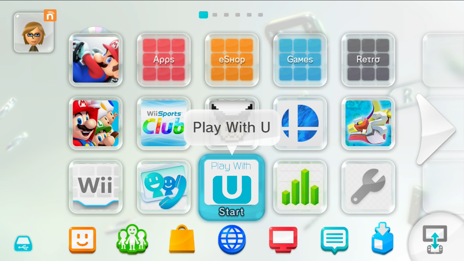
| ▲ | simianparrot 19 hours ago | parent | prev | next [-] |
| It reminds me of the Wii U interface[1]. Except less playful. It really is a disaster. [1] https://wiki.cemu.info/images/1/1a/Wii_U_Menu.png |
|
| ▲ | pndy 5 hours ago | parent | prev | next [-] |
| Not sure if people remember but Fisher Price was actually used to describe Windows XP's Luna theme. |
|
| ▲ | sitzkrieg a day ago | parent | prev [-] |
| totally agree, this is kind of an embarrassing look for supposed workstations |
| |